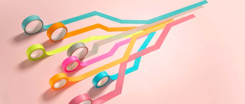
Feeling blah at work? Maybe your decor is the problem. Use color theory to help you feel calmer, more focused and more productive.
You don’t have to be an artist to understand how certain colors can inspire feelings and emotions. Some hues make us feel calm and centered; others, anxious and scattered.
“Color theory is both the science and art of using color,” explains Kris Decker at 99designs. “It explains how humans perceive color; and the visual effects of how colors mix, match or contrast with each other. Color theory also involves the messages colors communicate; and the methods used to replicate color.”
Picking the right hues for your office or cubicle can help make work more pleasant. But color theory is more than just finding the best shades to paint your office walls. It’s about inspiring the right vibe at the right moment in the right space.
How Can Color Theory Help?
When we’re young, our parents lecture us on which articles of clothing “go with” other items, based on color. We grow up and make decorating decisions for our own spaces, picking bedspreads, lampshades, etc. These choices can create an environment that makes us feel put together and confident — or not.
“…color can make us feel calmer, angrier, or more energized. It also provides important cues about our surroundings: Even in a new city, the red of a stop sign tells us to stop; the pigment of a fruit can inform us as to whether or not it’s ripe,” writes Cassie Shortsleeve at Condé Nast Traveler.
Colors aren’t universal in meaning, of course. “…color associations are often built into us and vary based on age, gender, location, and life experience—a food you ate and disliked as a child, say, or a memorable orange sunset,” Shortsleeve writes. “But there are some somewhat universal reactions to certain hues.”
How to Choose Colors For WorkSpaces
Instead of just picking a few shades that compliment each other, corporate interior designers look at how colors play together — much like coworkers in a large workspace. Designers must consider not just the complexity of work styles, but also the interactions between those styles.
“What was once merely a stylistic choice is now used as a tool to connect employees to the organizational brand, by helping them understand who they work for and why,” notes Udo Schliemann at Work Design Magazine. “Color can also improve one’s experience at work, positively affecting their concentration, stress levels, and mood. To achieve these objectives, it is important to understand how different colors interact with each other and also with other elements such as lighting, textiles and patterns. For these reasons, we should be sensitive to all aspects of color, using it to positively affect the workplace and its everyday users.”
In general and very broad terms, colors have been associated with these feelings or emotions, according to color theory and design principles:
- Red and Orange – Can provide an energy boost in small doses as an accent, but it can also spell danger or serve as a focal point for emergency signage
- Yellow – Can increase happiness in bright hues and calm in lighter ones
- Blue and Green – Can be calming or reassuring
- Pastels – Can also induce calm, but watch contrasts, as too much can produce eyestrain and stress
The combinations of colors in a workspace can affect how the employees’ brains respond. So designers and employers should take into consideration how each design decision might affect productivity.
A 2006 Wellesley College study “further relates some of the things we already know – color context changes based on other colors in the field of vision and that emotion is a big factor when thinking about color,” notes a blog post at Design Shack. “The study found that ‘globs’ in the brains of monkeys reacted differently to colored stimuli, and reacted based on color. The brain was most triggered by specific colors (red, then green, then blue) and colors with the most saturation. What this tells us is that these colors immediately impact a user and draw attention.”
Do you know your worth? Take the PayScale Salary Survey and get your free salary report today.
How to Choose Colors for Thinking Spaces
So, some bright colors can inspire us and pep us up, but what if your office is frenetic and full of motion? How do you get time and space to think? Designers often use soft tones for spaces where calm and quiet is important. (Think of pale green or yellow hospital walls.) But if you were to design your favorite thinking space, would it be perhaps blue like the sea? Or tan like your favorite desert landscape? Would it be soft with fuzzy rugs or have hard (but supportive) furniture to keep you awake?
Many large corporations take into consideration that not every employee likes to work with the same set of stimuli. They build thinking spaces that are pods, or libraries, or even just coffee shops away from the keyboards of the open office cubicles.
At Microsoft’s Milan, Italy offices, for example, “Certain areas are more communicative and others more private to create a workspace that is not monotonous and encourages creativity and interaction,” writes Eli Hill at Artsy. “…in order to meet employees’ need for collaboration and brainstorming spaces, [Italian architect] DEGW envisioned ‘creative gardens,’ which are semi-private wooden structures that include high-performance acoustics. Their exteriors are often embellished with plants, making them recognizable and inviting spaces in the office.”
In another examination of the same offices, the website Office Snapshots notes that the “non-assigned Open Space workstations on the various operating floors differ from each other in terms of layout and aesthetics in accordance with functions and requirements. Certain areas are more communicative and others more private to create a workspace that is not monotonous and encourages creativity/interaction.”
Shaping Your Own Spaces With Color
Have you been given a blank slate to decorate at work? Think about how you’d make your work area fit your needs. If you’re stressed by the pace of things, you might need to create a relaxing space to think. On the other hand, if you’re frequently stuck in the doldrums, you might choose to decorate your work area to inspire more invigorating vibes.
“Our nervous system requires input and stimulation,” writes Jill Morton on Colorcom.com.”(Consider the effects of solitary confinement in jails.) With respect to visual input, we become bored in the absence of a variety of colors and shapes. Consequently, color addresses one of our basic neurological needs for stimulation.”
So in addition to finding what colors you need to bring you up or cool you down, finding textures, combinations and emotion-inducing stimuli is also key to fueling your space.
Finding Inspiration from the “IN” Colors
You’ll stumble past a store window and wonder where all these ____-colored clothes came from. Many months in advance, designers decide on the upcoming season’s new color.
For example, in the fall of 2019, the spring 2020 collections were mostly hitting on a shade of yellow that fashion writers dubbed “optimistic.” In another piece, Laurie Pressman at Pantone remarked that the colors seen on the runways last fall were noted as “familiar and reliable.” Is this influx of colors that we find more in-line with steady, honest, dependability because of wild current events and turmoil? Or is it just a coincidence?
The colors we associate with childhood are frequently either primary colors like red, blue and yellow — or pastels.
“The brighter and lighter a color, the more happy and optimistic it will make you feel,” writes Allison S. Gremillion at 99designs in a recent piece on color theory and emotions. “Another way colors can create happy emotions is by combining multiple primary and secondary colors together for a youthful, colorful effect.”
Or maybe the choices for 2020 colors are a reaction to a previous season’s shades — spring/summer 2019 were deemed “vibrant without being overpowering” by Pressman at Pantone. “The mindset for Spring/Summer 2019 reflects our desire to face the future with empowering colors that provide confidence and spirit; colors that are uplifting; joyful hues that lend themselves to playful expressionism and take us down a path of creative and unexpected combinations.”
Of course, that seasonal color palate also means that people who care about fashion are more likely to buy new clothes — and decor — each year. Well played, movers and shakers.
TELL US WHAT YOU THINK
What’s your favorite workspace color combination? We want to hear from you. Share your story in the comments or join the conversation on Twitter.